Theme Options
Below are customization options built this theme
|
|
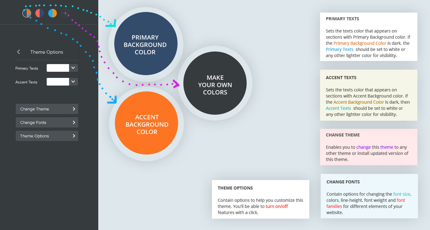
Primary Texts:
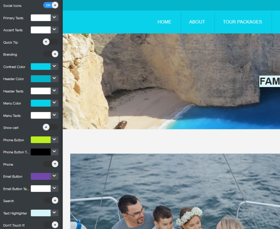
Sets the texts color that appears on sections with Primary Background color. If the Primary Background Color is dark, the Primary Texts should be set to white or any other lightter color for visibility. Accent Texts: Sets the texts color that appears on sections with Accent Background color. If the Accent Background Color is dark, then Accent Texts should be set to white or any other lightter color for visibility. Texts Color: Sets the text color of the paragraph "Text" element. Use this color option instead of weebly default option for styling the text element. Quick Tip: Add/Removes the welcome screen with the message on how to get started. Branding: Add/Remove the "Powered by Roomy Themes" branding in the footer. Builder Guides: Add/Remove guides from the website editor. The "Builder Guides" helps identify content sections such as where to edit and where to drop elements. Contrast Color: Sets link color and links hover color. Contrast color should always be set to a dark color such as blue, red, orange, etc. for visibility. |
|
|
|
Header Color:
Sets the background color of the header. Header Texts: Sets the texts color of header texts. Menu Color: Sets the background color of the menu bar. Menu Texts: Sets the texts color of menu texts and cart. Phone Button: Sets the background color of the phone button. Phone Button Texts: Sets the texts color of the phone button. Email Button: Sets the background color of the email button. Email Button Texts: Sets the texts color of the email button. Text Highlighter: Highlights the texts with a light background color. |
|
